
The kitchen is the heartbeat of the home—a space where functionality and atmosphere should seamlessly intersect. Yet, even well-intentioned renovations often fall victim to surprisingly common design missteps that instantly trigger a designer’s cringe. We asked three leading interior architects to share the kitchen habits and trends that consistently miss the mark, plus straightforward fixes to restore balance, warmth, and effortless style to your cooking space.
Meet the Expert Marcus Chen is the founder of Studio Terra, a firm specializing in sustainable residential design. Sofia Delgado is the lead interior architect at Luxe Living Interiors. Julian Vance is the creative director at Modern Hearth Design.
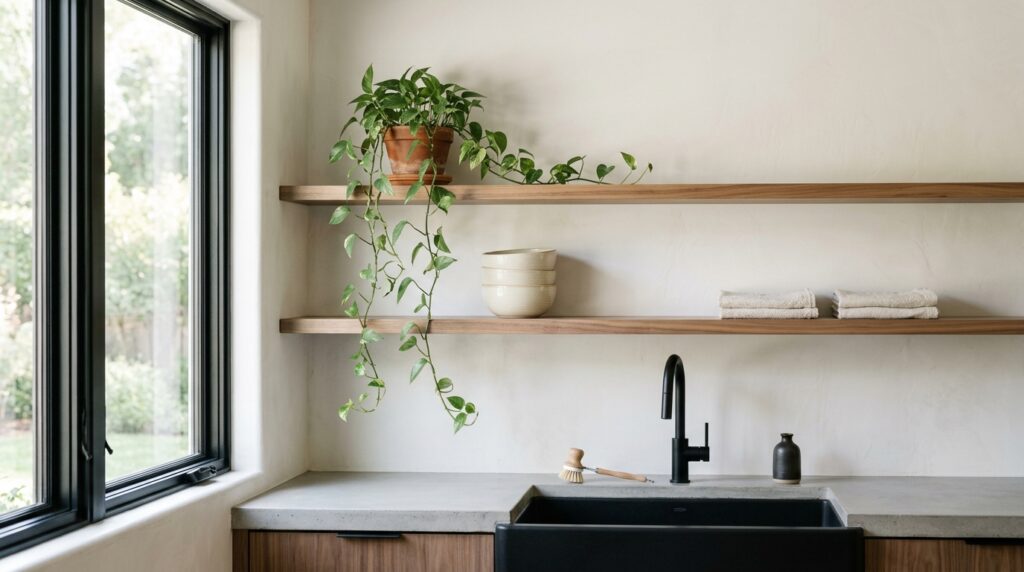
Overcrowded Open Shelving Interior architect Sofia Delgado appreciates the airy aesthetic of open shelving, but warns against turning it into a storage catch-all. “Open shelves look incredible when they’re treated as a gallery, not a pantry,” she explains. “The moment they’re packed with mismatched mugs, bulky appliances, and random pantry items, they read as messy and overwhelm the sightlines.”
If you’re drawn to open shelving, Delgado recommends limiting it to one or two strategic runs. Style them intentionally: stack cookbooks horizontally, display a cohesive set of ceramics, and leave 30–40% of each shelf empty to let the eye rest. Store everyday clutter behind closed cabinet doors.
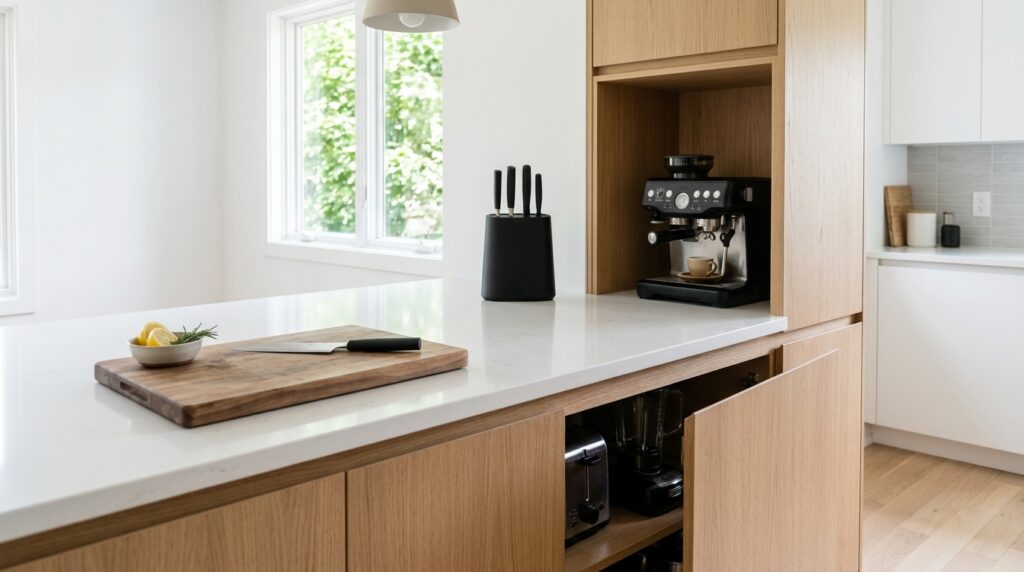
Appliance-Heavy Countertops Nothing kills a kitchen’s sense of calm faster than a countertop that doubles as an appliance garage. “When every gadget is out in the open, the space instantly feels smaller and harder to clean,” says Marcus Chen. “Counter space is premium real estate—it should be reserved for prep, not storage.”
Chen’s fix is simple but transformative: designate a dedicated appliance garage in lower cabinets, or use a stylish countertop cabinet with roll-up doors. Keep only one or two frequently used items visible, like a sleek kettle or a wooden knife block, and tuck the rest away.
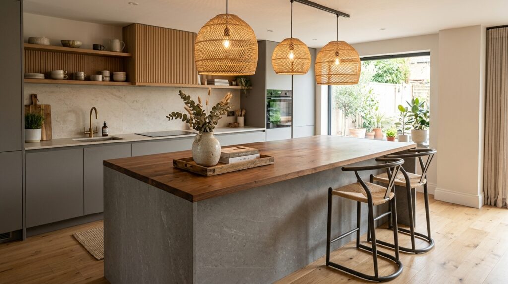
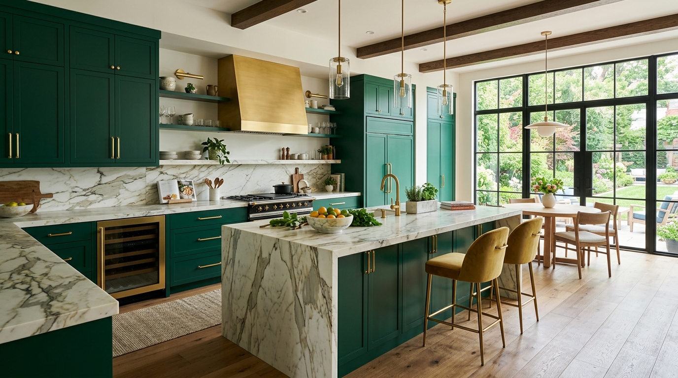
The Monolithic Kitchen Island Kitchen islands have become ubiquitous, but Julian Vance argues that oversized, one-dimensional islands are a major design regret. “When an island takes up too much floor space, it disrupts the work triangle and turns the kitchen into an obstacle course,” he notes. “It stops being functional and starts feeling like a showroom display.”
To soften a massive island, Vance suggests breaking up the visual weight with varied countertop materials (like pairing stone with wood), adding integrated seating on only one side, and using layered lighting to draw the eye upward rather than outward.
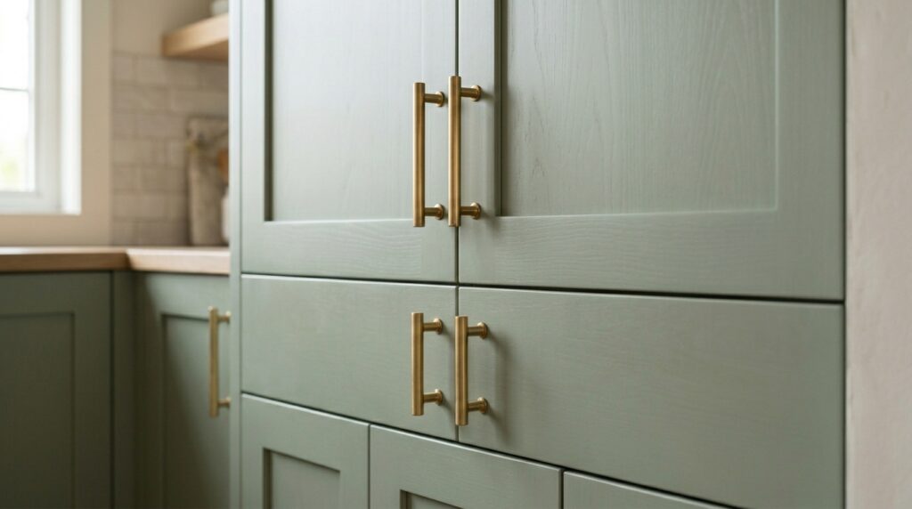
Inconsistent Cabinet Hardware Swapping out knobs and pulls is one of the most cost-effective kitchen upgrades, but Delgado cautions against mixing finishes without a clear vision. “Hardware is the jewelry of the kitchen. When every drawer has a different metal tone or silhouette, it creates visual static and dates the space immediately.”
For a cohesive look, pick one primary finish (brushed brass, matte black, or polished nickel) and stick to it across all doors and drawers. If you want to layer metals, confine the secondary finish to plumbing fixtures or light fixtures only. Choose clean, proportional handles that complement your cabinet profile rather than compete with it.
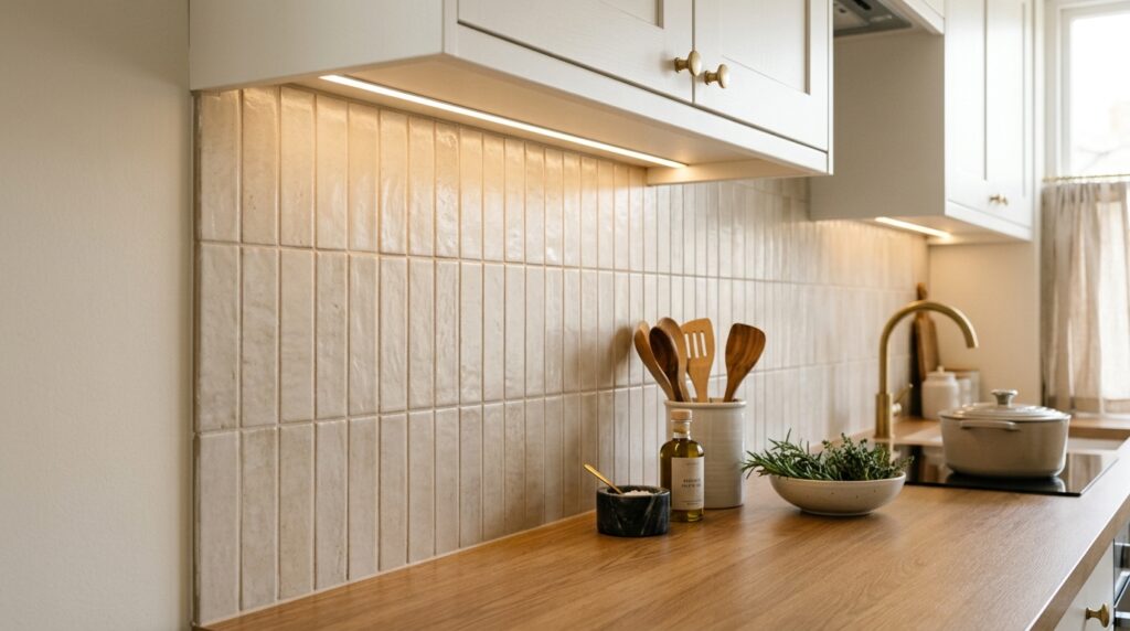
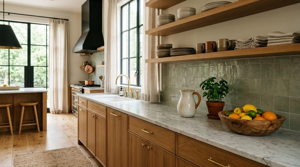
Visually Noisy Backsplashes A backsplash should enhance a kitchen, not dominate it. According to Vance, overly intricate patterns and high-contrast color combinations are a frequent misstep. “When the tile fights for attention, it pulls focus away from beautiful cabinetry and countertops,” he says. “The backsplash should be the supporting actor, not the lead.”
Opt for timeless layouts like stacked, herringbone, or vertical subway in muted, tonal palettes. If you crave texture, explore hand-molded zellige tiles, fluted glass, or matte stone veneers that catch light subtly without overwhelming the space.
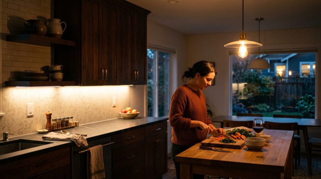
Unforgiving Overhead Lighting A bright kitchen is desirable, but harsh, unfiltered overhead lighting is a universal designer pet peeve. “Cool-toned recessed cans wired to a single switch create a clinical, cafeteria-like environment,” Chen explains. “Kitchens should feel layered and adaptable, especially in the evening.”
Replace or supplement flat overhead fixtures with dimmable, warm-white LEDs (2700K–3000K). Add under-cabinet lighting for task zones, install a statement pendant over prep or dining areas, and use plug-in wall sconces to create pockets of cozy, indirect illumination.
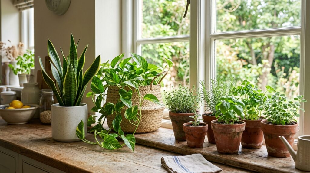
Plastic-Look Artificial Greenery Bringing botanical elements into the kitchen adds life and softness, but fake plants that scream “plastic” instantly undermine a space’s authenticity. “Artificial foliage might look convincing from across the room, but up close it collects dust, fades unevenly, and makes the design feel stagnant,” Delgado observes.
Choose real, low-maintenance alternatives like trailing pothos, snake plants, or a small herb window box that doubles as fresh garnish. If you absolutely need faux greenery, invest in high-quality silk varieties, place them out of direct sightlines, and dust them regularly to maintain realism.